7000+ is a fictional publishing house dedicated exclusively to publishing texts at the crossroads of languages.
This project is a research-oriented exploration…:
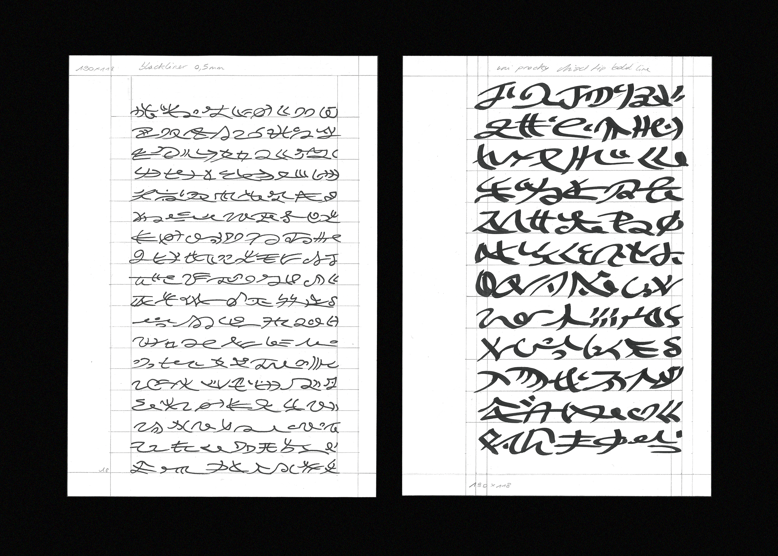
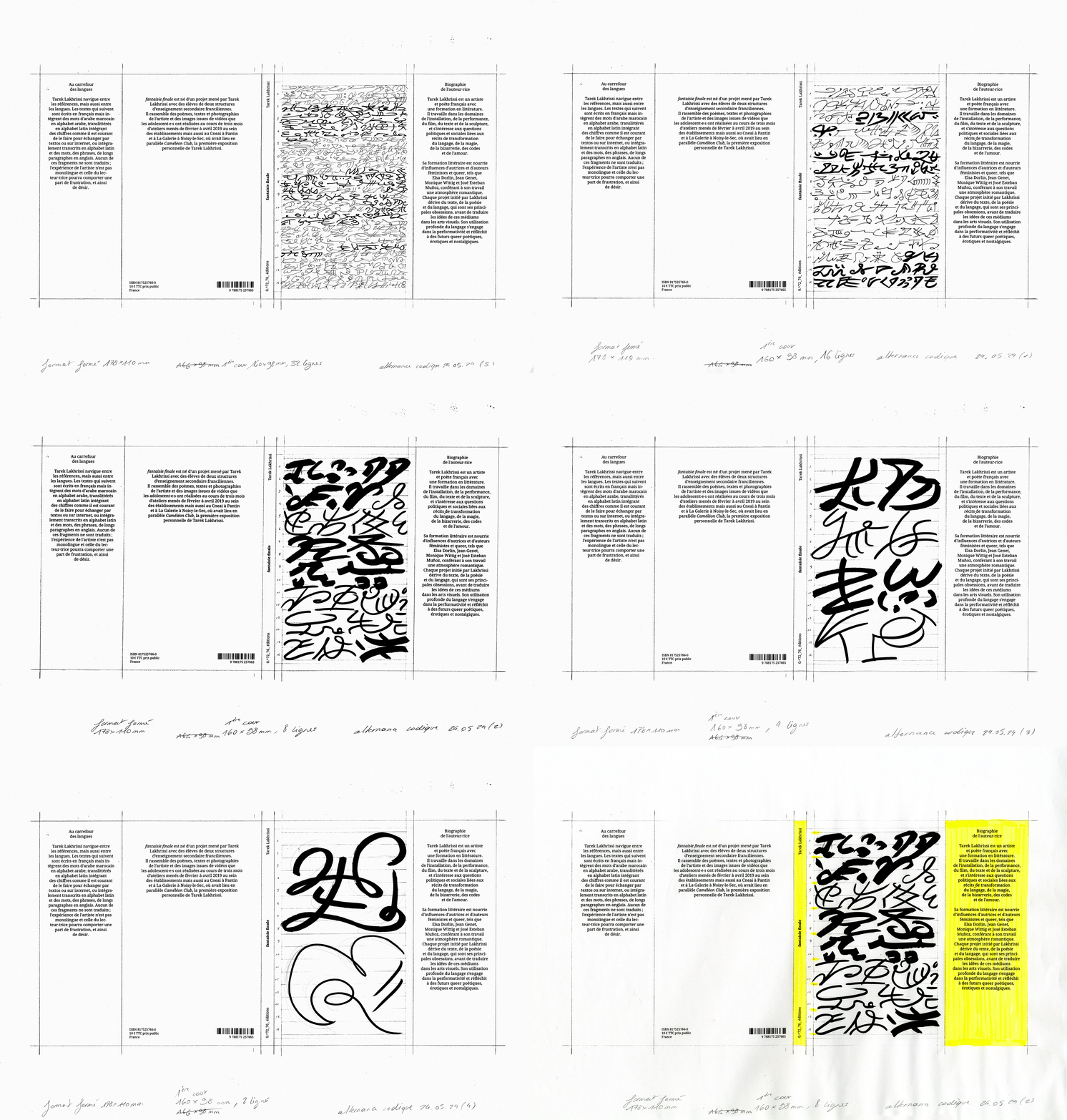
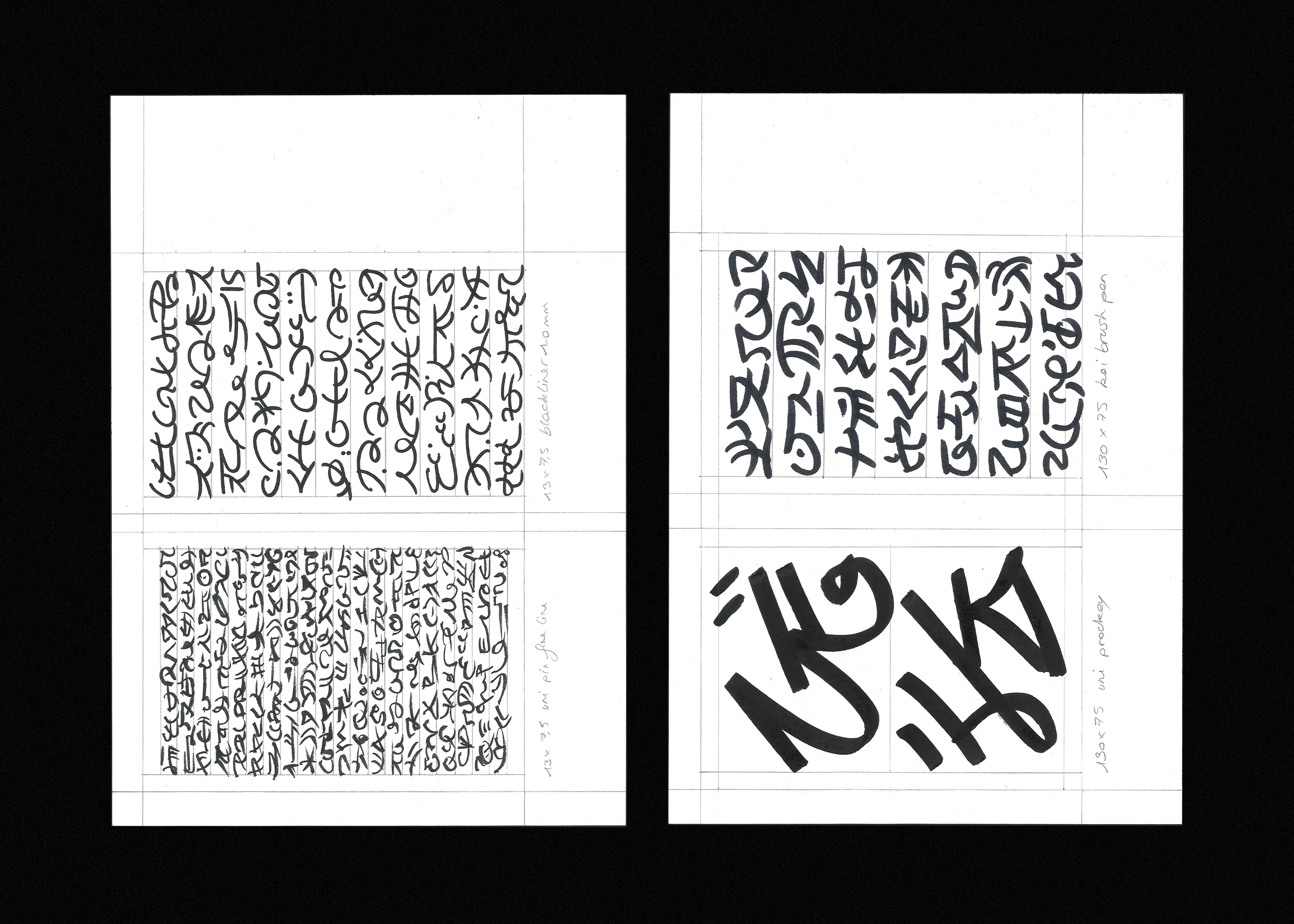
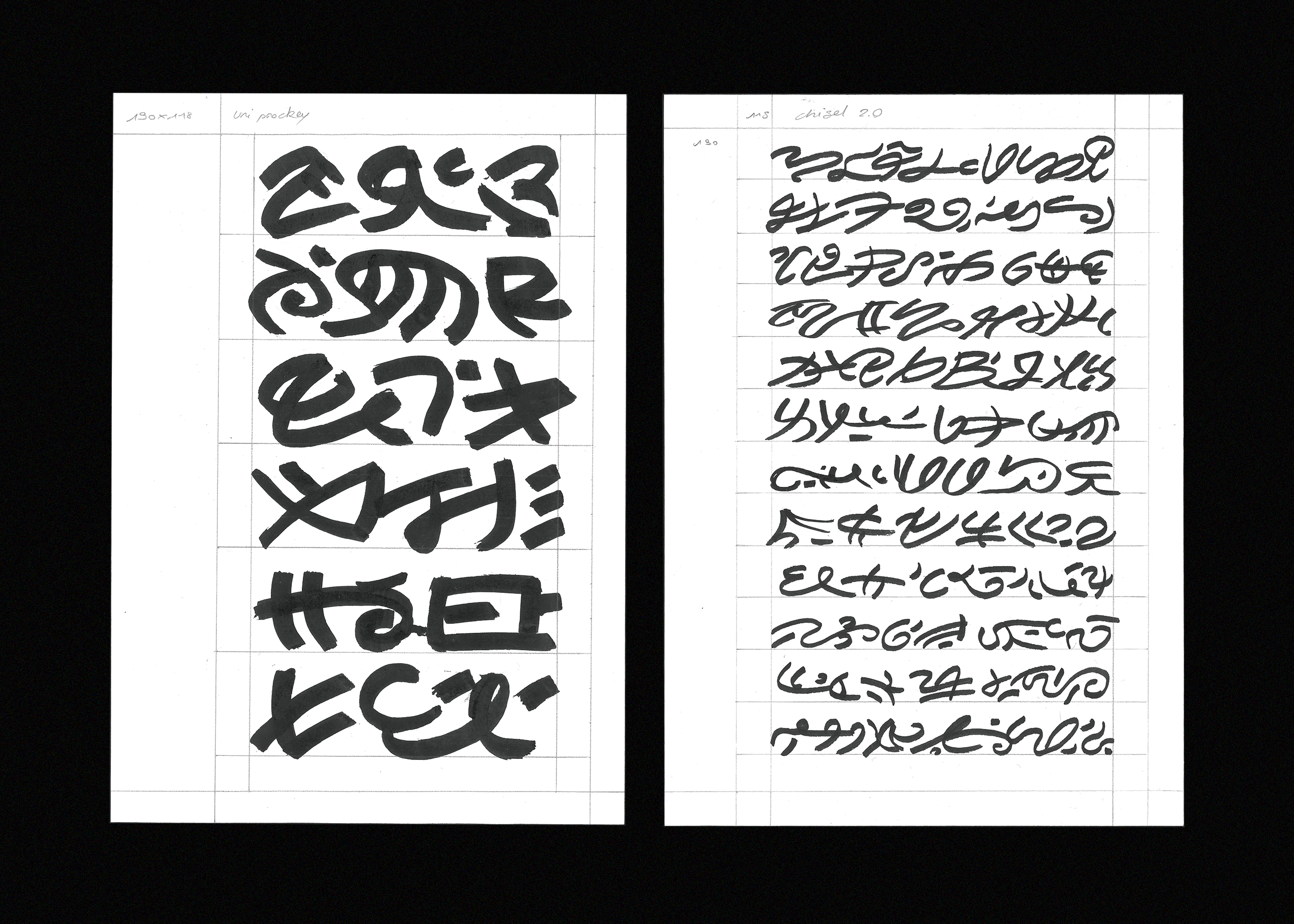
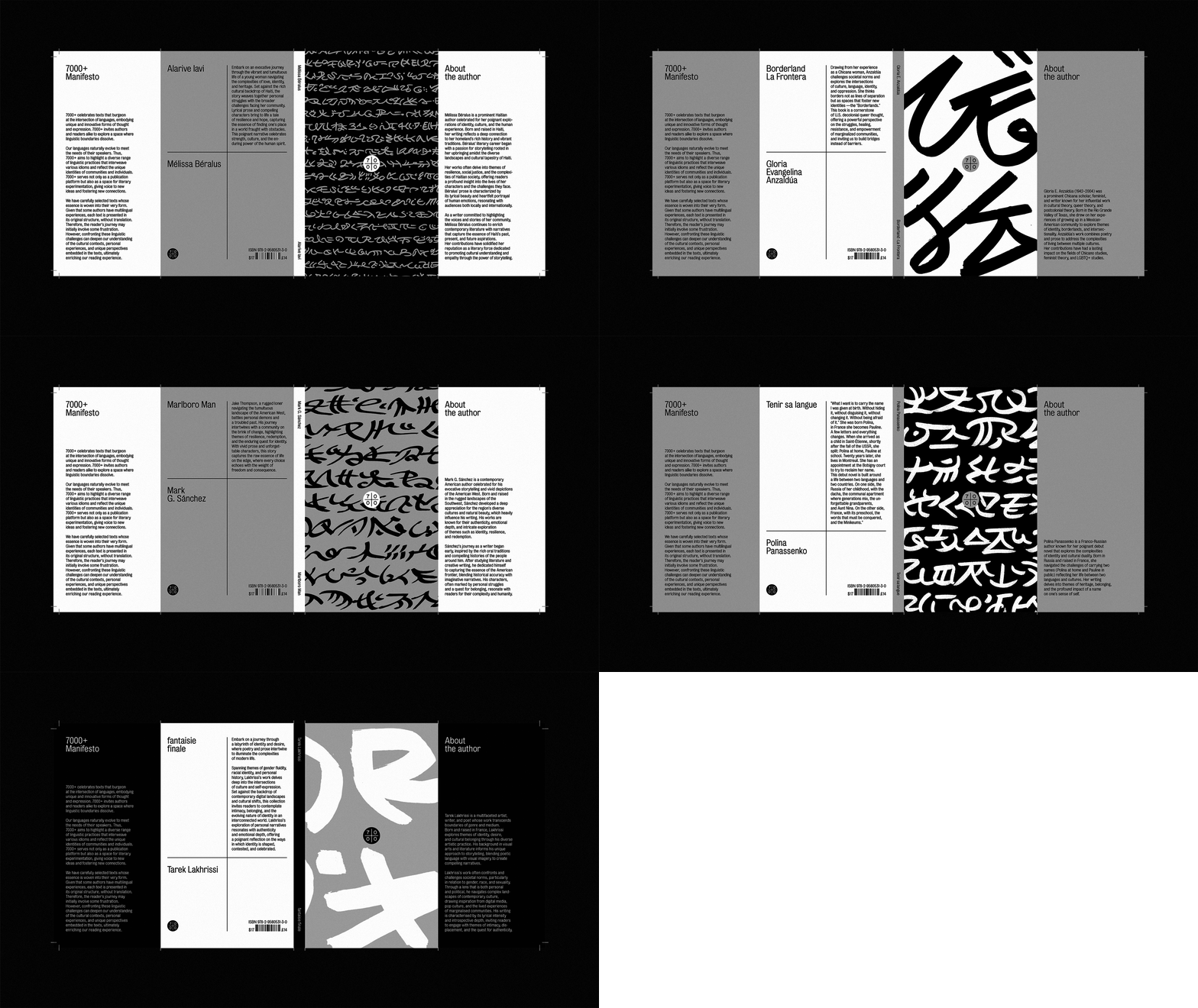
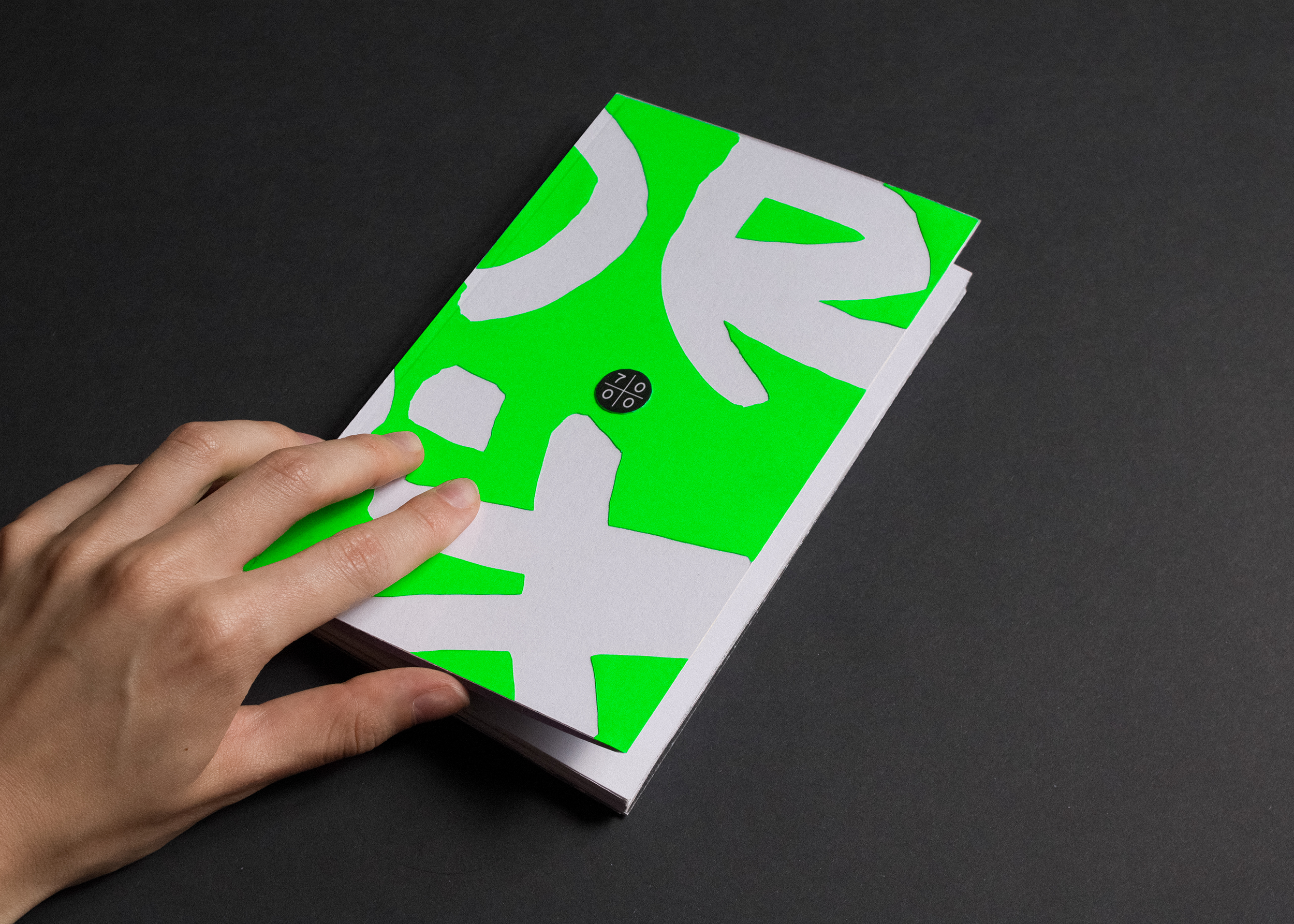
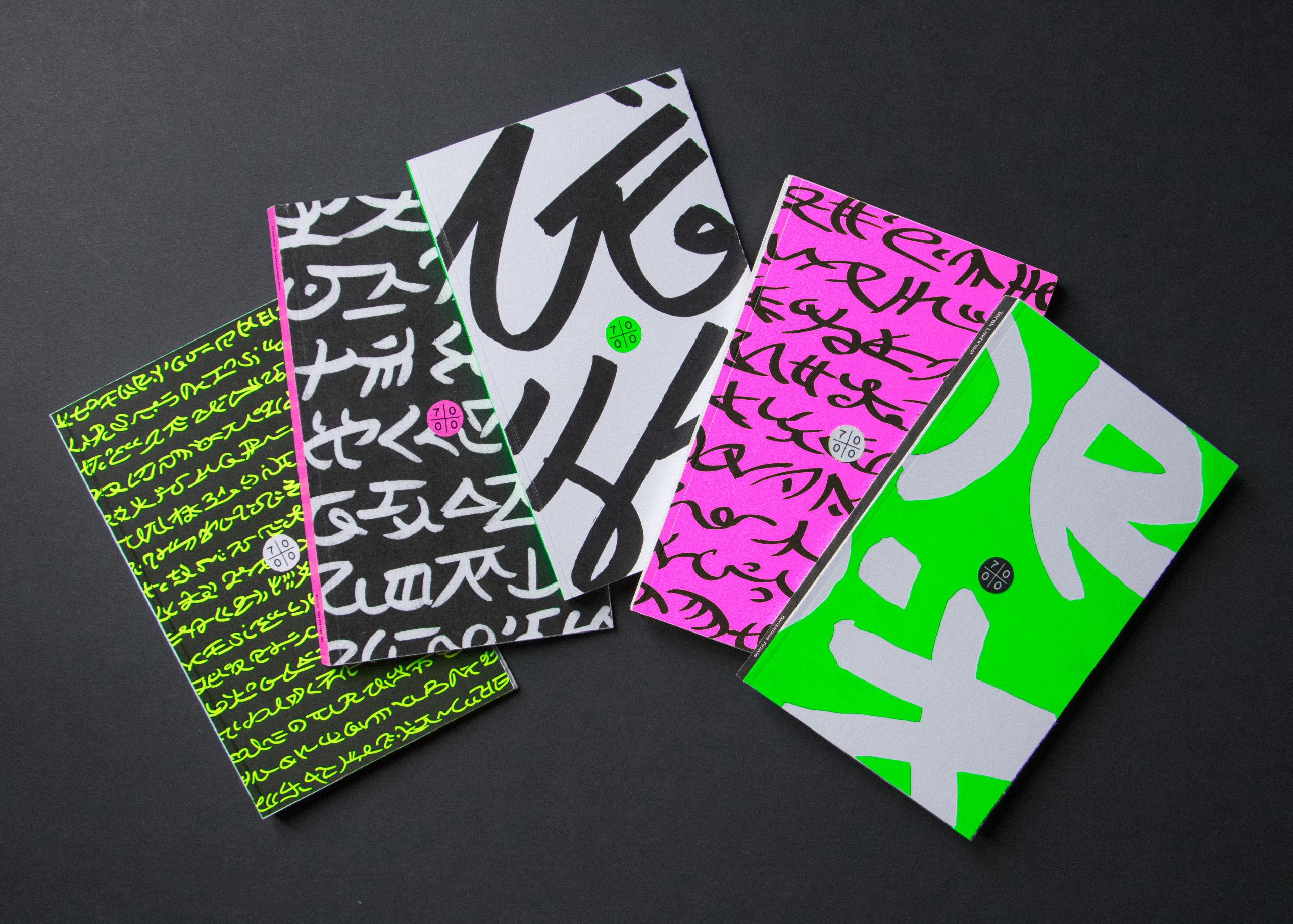
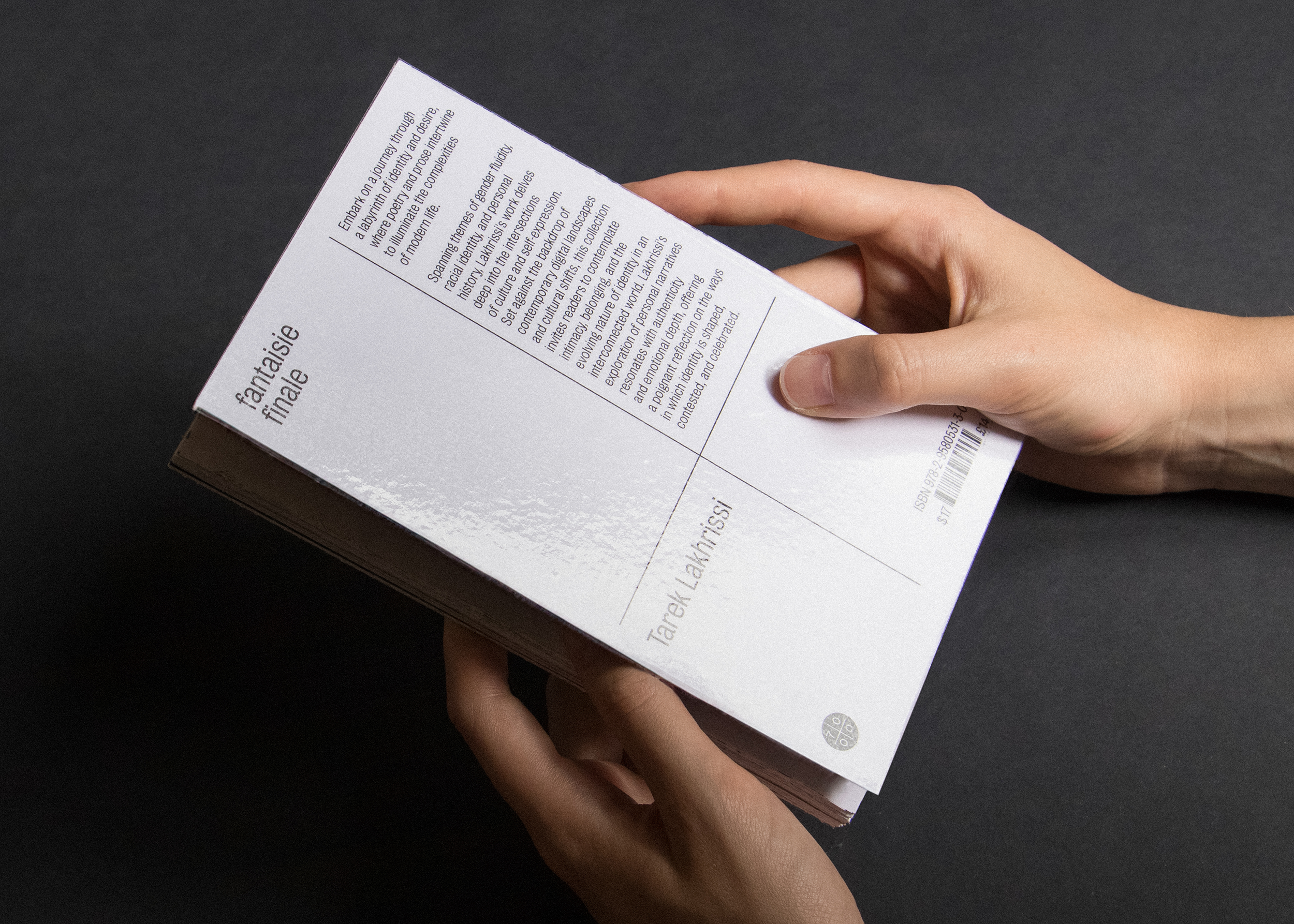
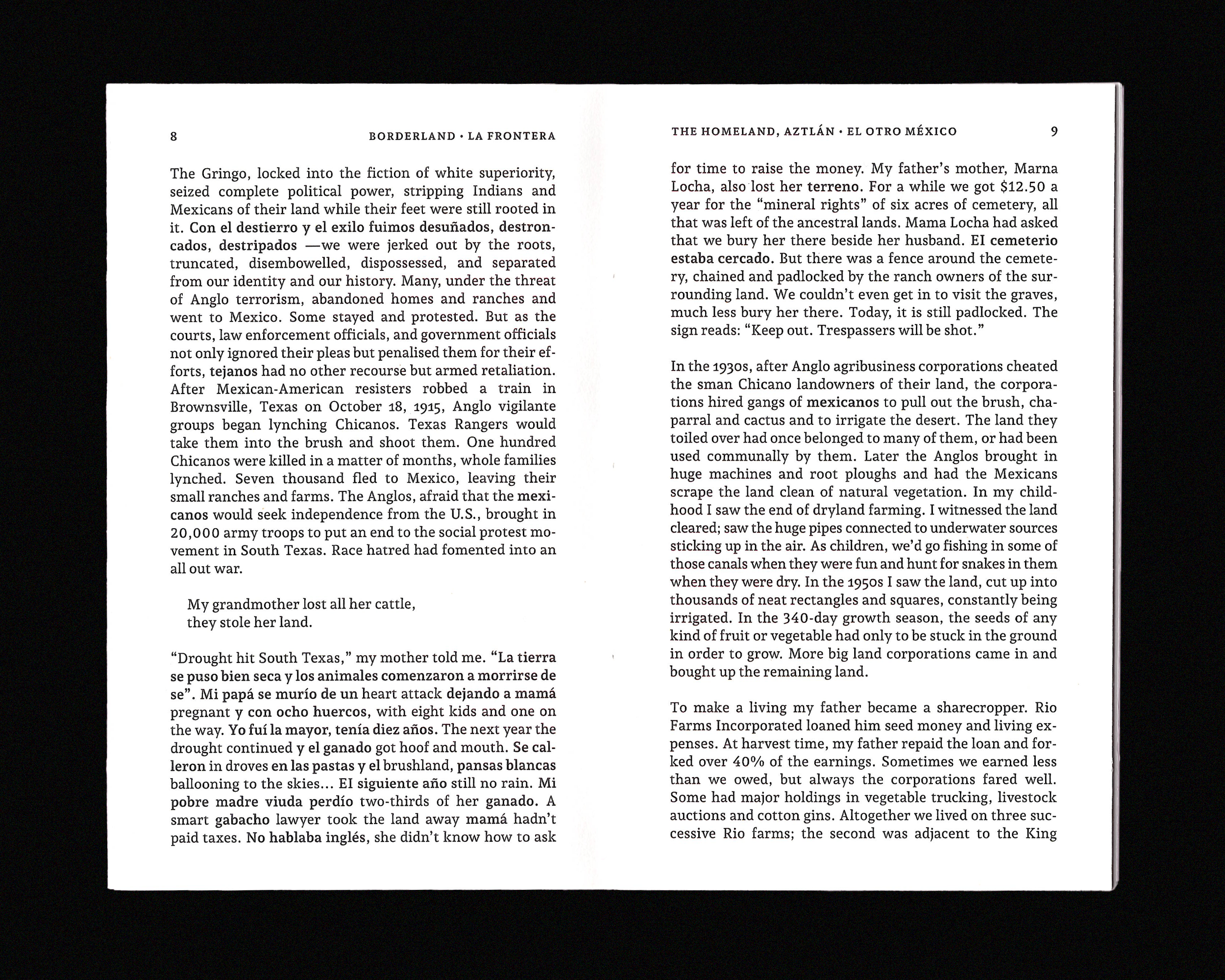
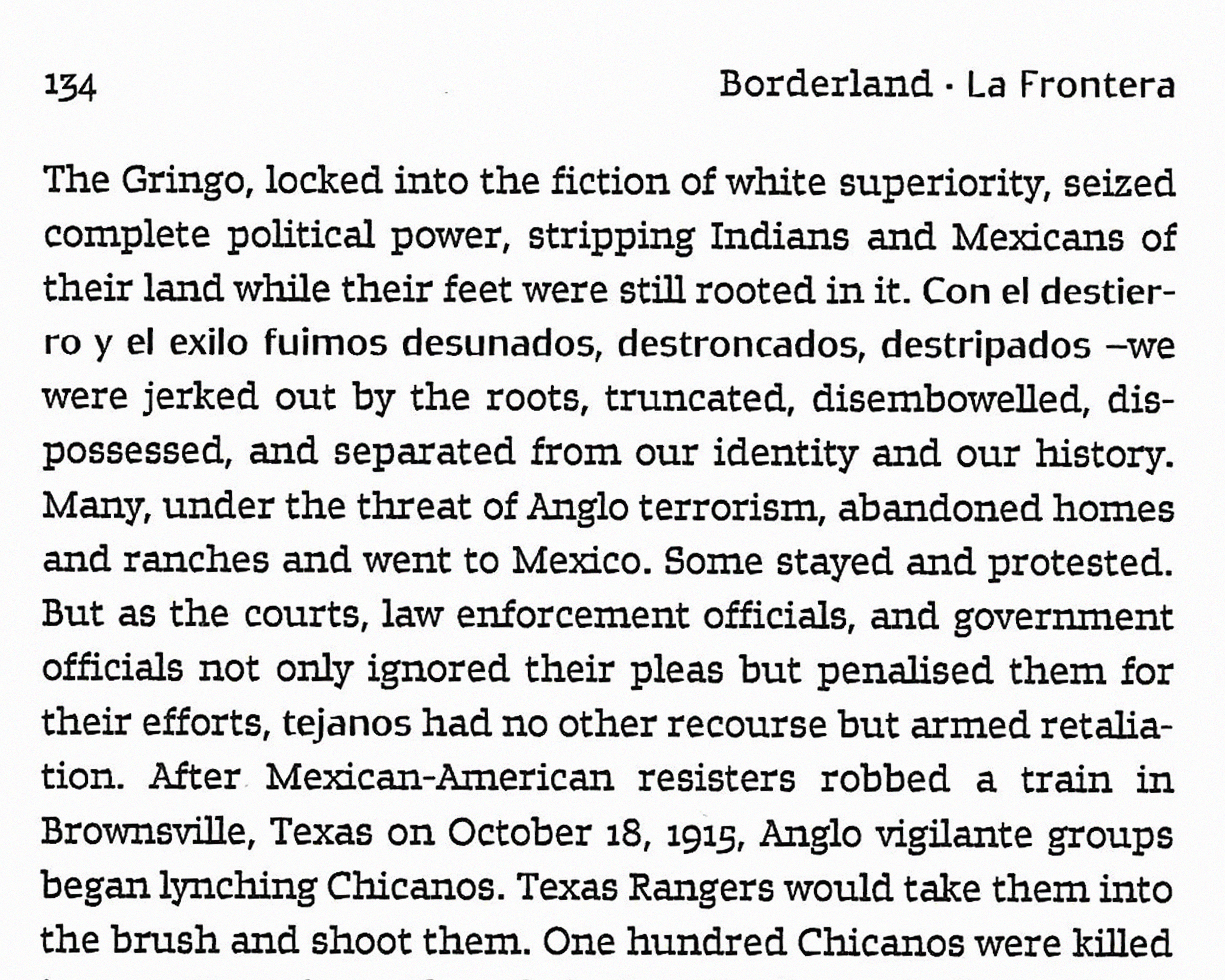
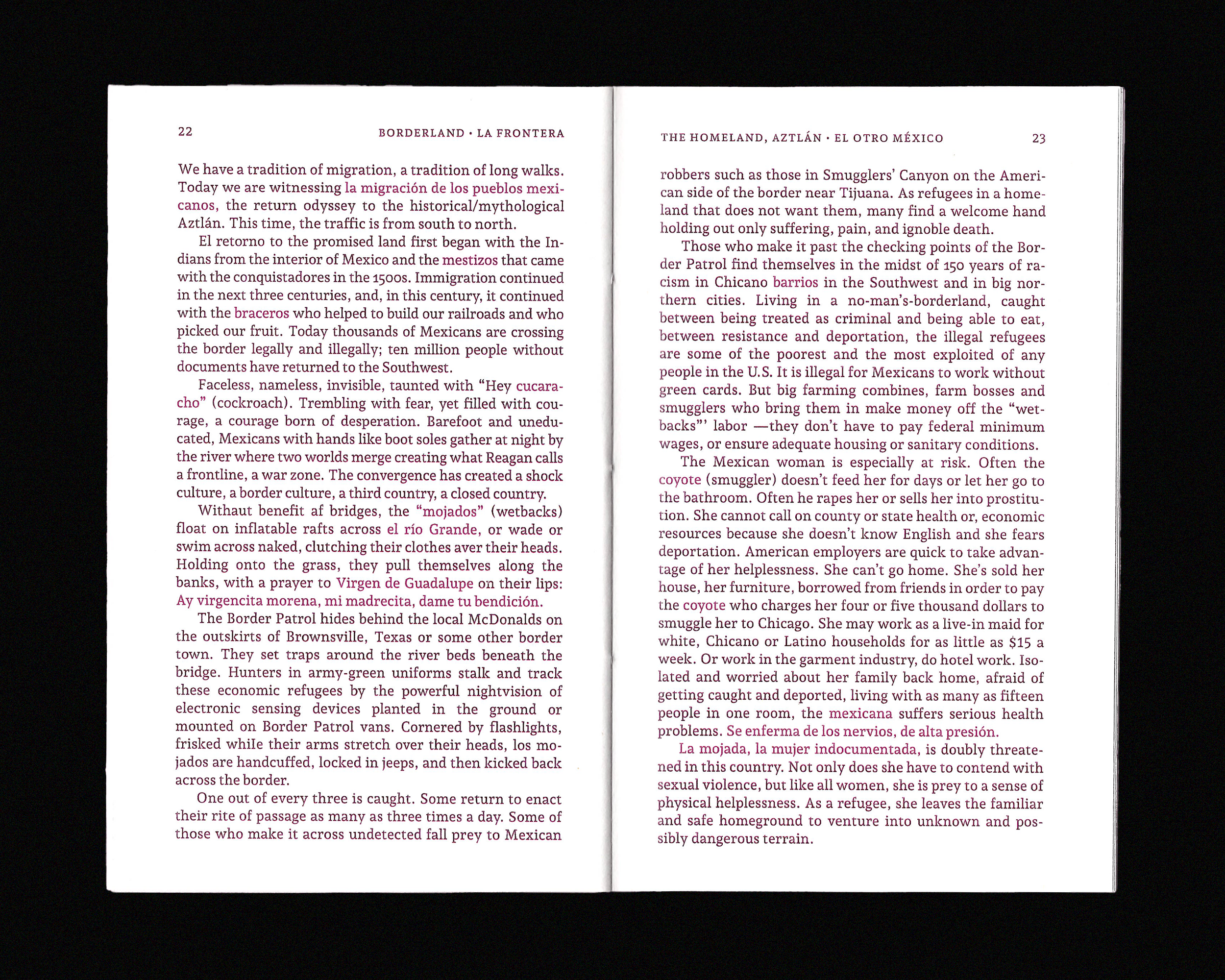
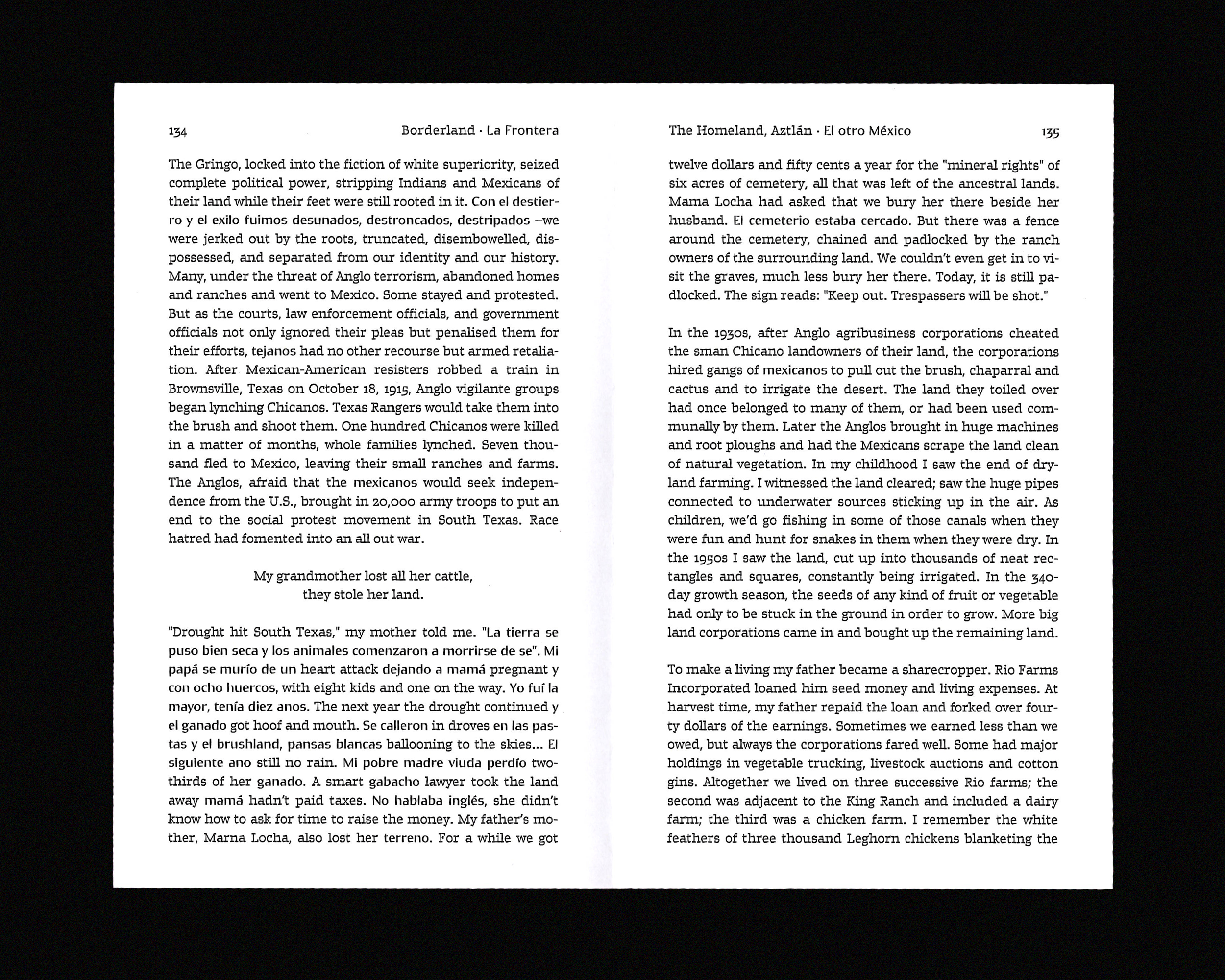
This project is a research-oriented exploration, rather than a ready-made solution. Across the covers, a sibylline script spans the surface, woven from elements of around a dozen ancient writing systems, including Phoenician, runic, Demotic, and Ogham. The resulting visual vocabulary emerges from a multi-stage process of documentary research, transcription, and the creation of new signs. For the inside pages, the focus is on the microtypographic treatment of code-switching texts, utilising two, three or more languages, with identical or different alphabets. It takes into account the publisher’s wish to distinguish between these languages to varying degrees, without, however, establishing a hierarchy amongst them. The approach involves identifying, examining and comparing typographic alternatives to italics that are less marked by a form of linguistic ethnocentrism. Among these is Gemini, designed by Sandrine Desvignes: ideal for bilingual literature, this typeface conveys duality while maintaining a consistent visual texture throughout the text. In addition, the tests were carried out on extracts from Borderlands La Frontera: The New Mestiza by Gloria Anzaldúa and Marlboro Man by Mark G. Sánchez, both written in Spanglish. In short, how can the concept of linguistic encounter be visually conveyed in the design of a book series?